Hike Smart
assisting novice hikers before + during the hiking process
What
A compact, foldable, digital smart map that supports beginner hikers through the stages of hiking whilst providing information about preservation and conserving the trails around them.
Contributions
User Interview, Competitive Analysis, Persona, User Journey Map, Storyboard, Wireframes, Usability Testing, Prototypes
Project Type
Group project (4-person team)
Duration
11 weeks
Overview
Our team of four undergraduate HCDE students at the University of Washington found that for beginner hikers, navigating the world of hiking can be challenging. Novice hikers often don’t know where to begin or how to hike responsibly and safely. Our research found that beginner hikers were negatively impacted from environmental damage and pollution which distracted from the feeling of being in nature, and desired to conserve the environment around them.
We aim to provide novice hikers with a tool that assists them in the hiking process as well as helps accomplish environmental stewardship. Addressing this problem is the concept of our digital smart map that will guide users through different stages of their hike (before, during, and after) and provide a specified guide to each hike the user goes to, such as hiking items, alerts and policies about the area.
Research Findings
To understand our users, we conducted user research which consisted of semi-structured interviews and competitive analysis. Each member of our team scheduled and interviewed four potential users. We asked them about their prior hiking experience, thoughts on trail environmentalism, and use of technology. Recording and synthesizing interview responses revealed valuable insights and helped us identify common pain points which include:
Beginner hikers had difficulty coordinating with friends and working around schedules, weather
Felt that trash and pollution on trails makes it less enjoyable and takes away from being connected with nature
Had no way to know beforehand about damaged areas that can interfere with their hike path
Had a hard time figuring out what equipment to carry along the hike
Planning hikes takes too much time and energy
Desire to stay connected with friends and nature
Competitive Analysis
Examining Competitor Products
Utilizing the above user goals and motivations, we scouted, analyzed and identified how existing products met or failed user needs. Our team examined the features and affordances of AllTrails, Washington Trail Association (WTA), and EcoHike as part of this competitive analysis.
EcoHike screens from the Ukrainian App Store
Personas
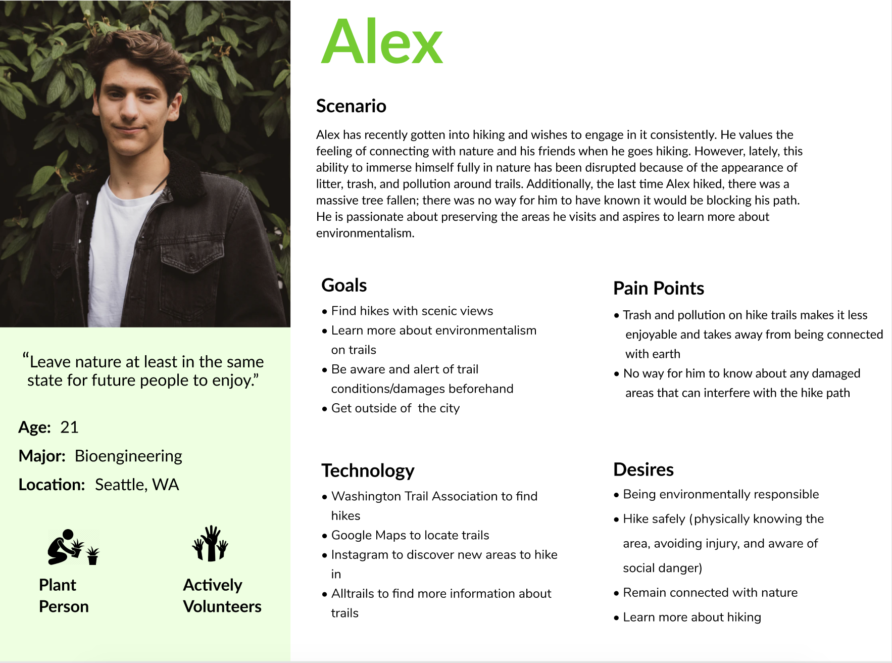
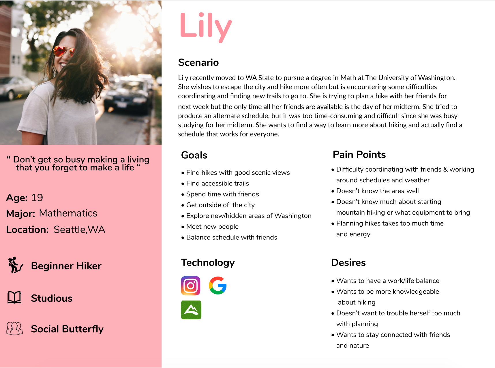
Meet Alex & Lily!
After synthesizing research findings, we constructed two personas as a reflection of our core users. With this archetype, we aimed to gather user research data in a way that constantly reminded us of who we were designing for. The majority of the characteristics, pain points, desires, goals, and demographic information of Alex and Lily were derived from interview response recordings.
Based on the critique feedback, we decided to brainstorm solutions catered more to Alex’s persona instead of Lily. One aspect of Lily’s persona revolved around scheduling and coordinating hiking plans. We found this area was heavily explored through other already existing digital products and we felt that incorporating a scheduling element into our problem statement and any potential solutions would not reach the full potential of our project. The scheduling aspect was abandoned after consulting with our professors and peers, and we decided to primarily focus on learning about hiking and easy access to information for Lily’s persona. Our team felt that Alex’s diverse persona was more valuable in terms of containing data ripe for solution space exploration. The personas we devised served as a guide for our users desires and needs.
User Journey Map
Our team created a user journey map of our user, Alex, that visualized how he engaged with the hiking process and illustrated what emotions were felt throughout the various touch points. Understanding which actions were associated with negative emotions, such as feelings of disappointment and frustration, helped us identify opportunities for design. These design opportunities eventually evolved into design requirements for our digital map.
Design Requirements
Design requirements were created to determine what tasks our product should accomplish and narrow down pain points. The requirements were based on the information we gathered from our user interviews, user research, personas, and journey maps. Using these requirements as a focus, we designed our low fidelity prototype in the next step.
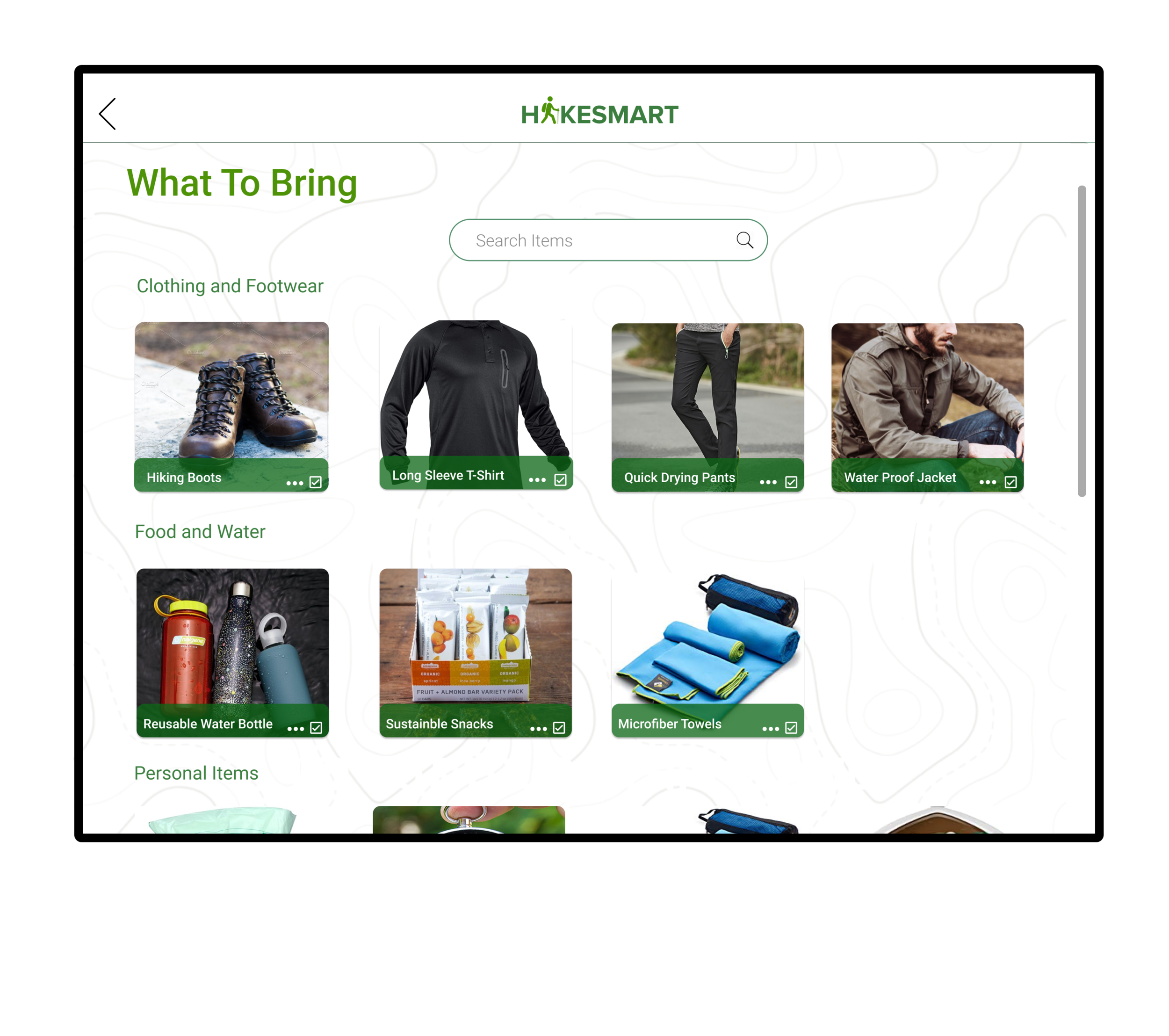
Remind users of what items to bring before a hike
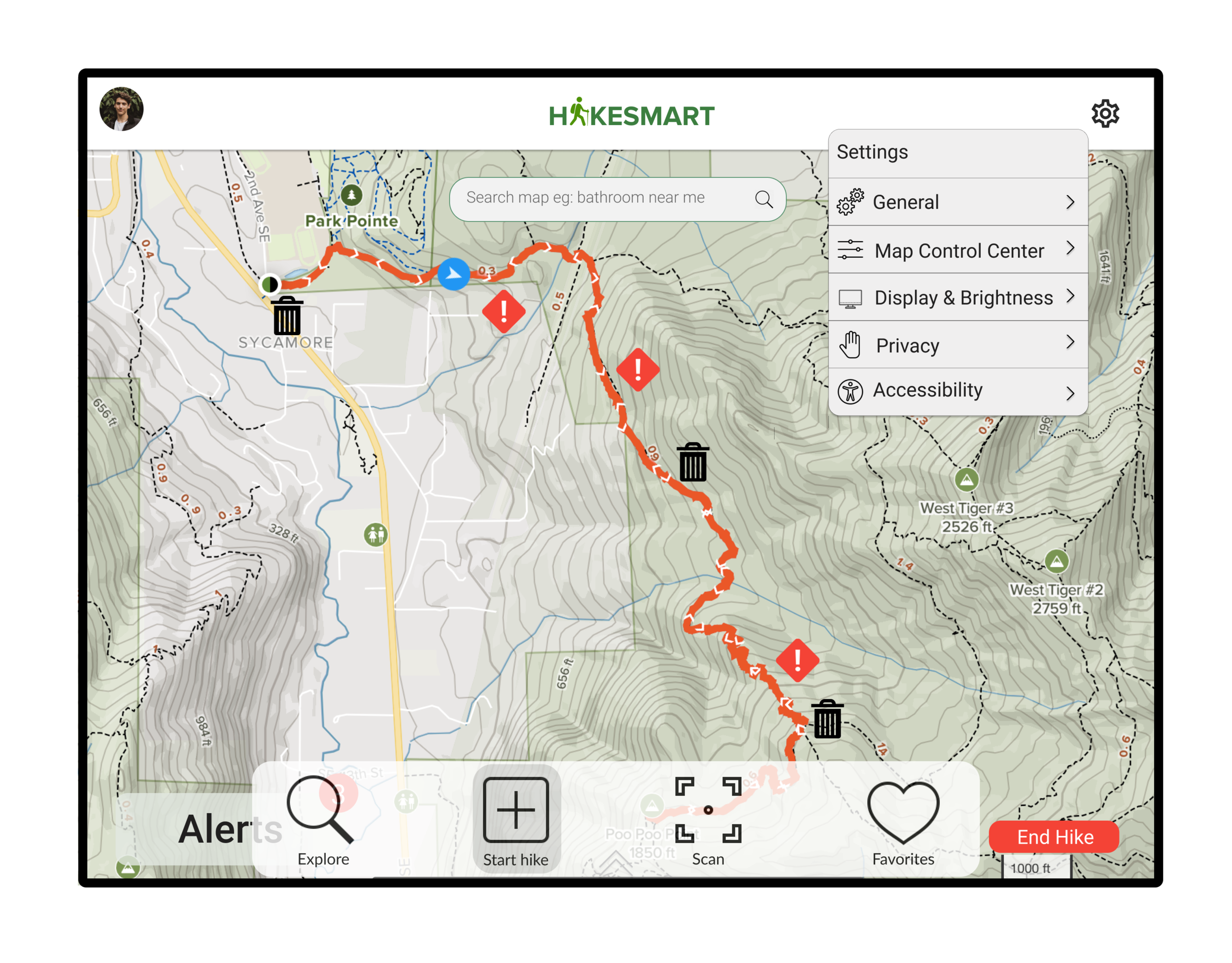
Locate and notify users about any alerts while on trail.
Report and mark locations of environmental damage on trails while on the hike
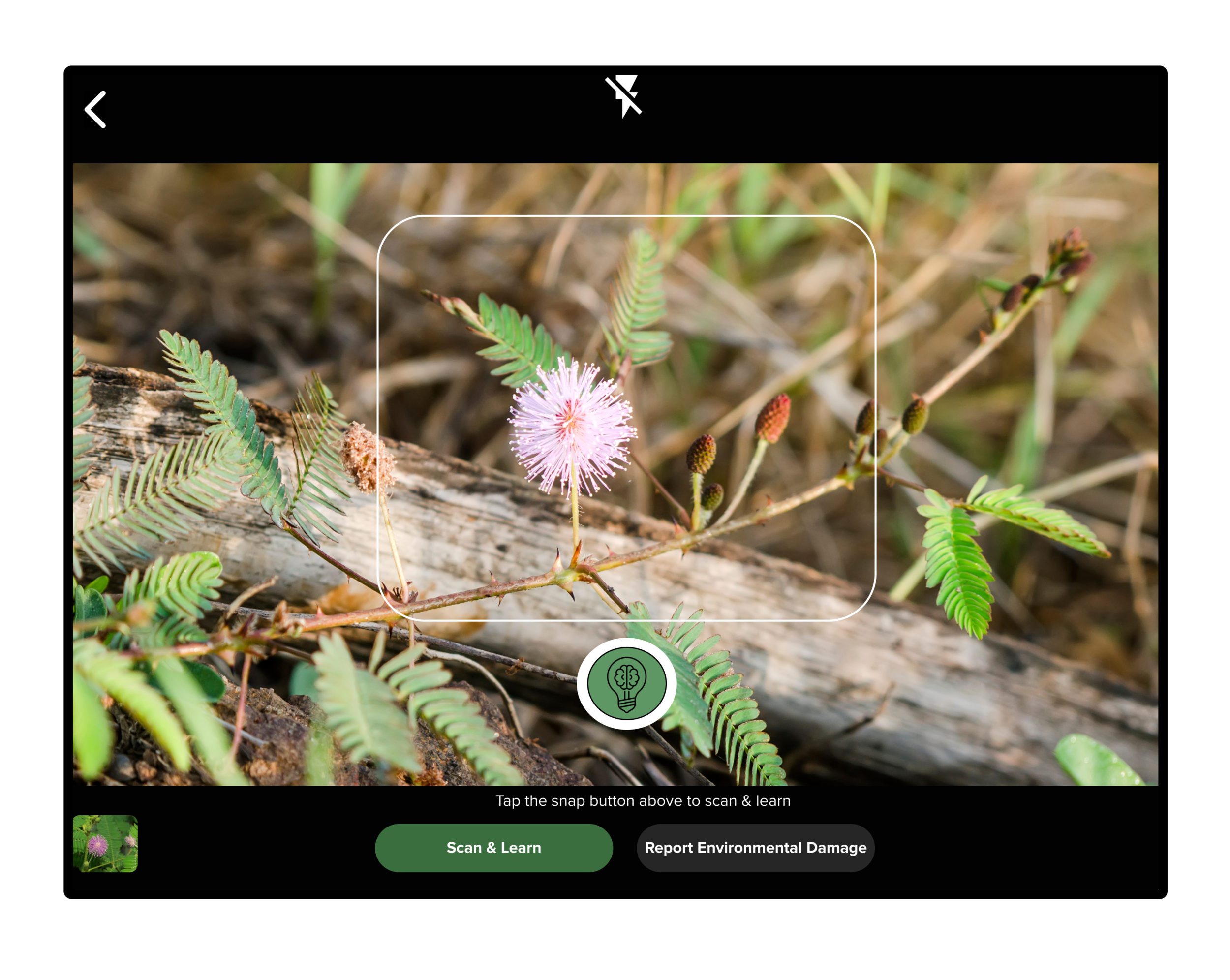
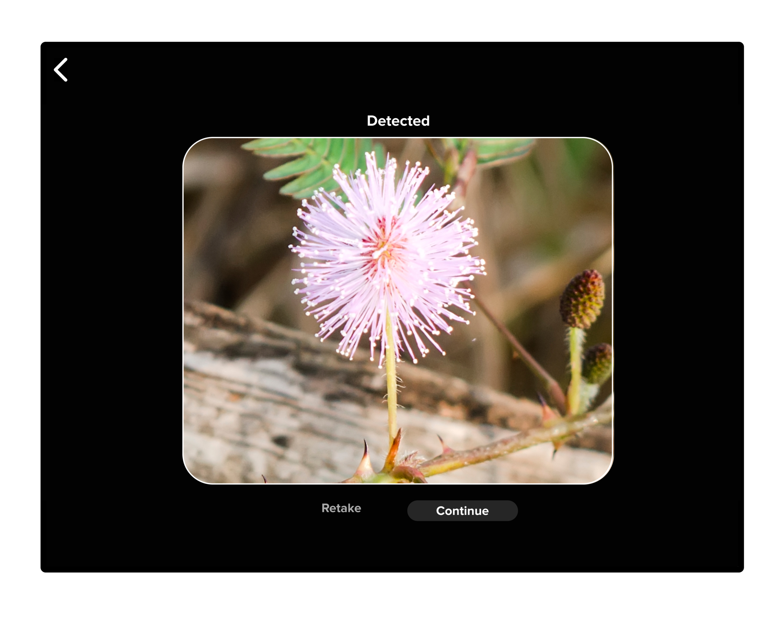
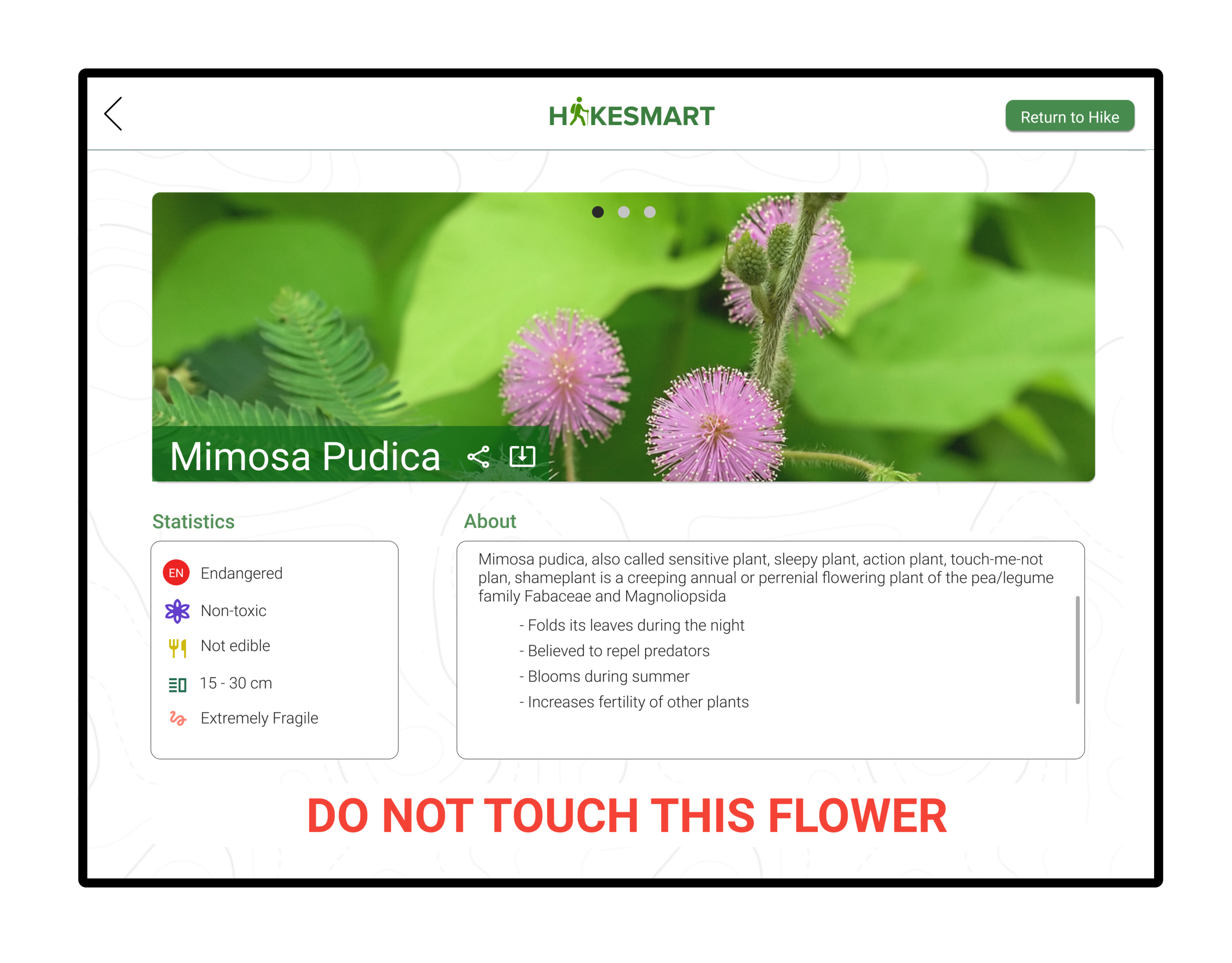
Allow mage recognition of wild flowers to retrieve facts and endangerment status.
Interact with map to view crowded/uncrowded hiking spots.
View virtual tour of hike while planning
Storyboards
The story boards were created to visually communicate how our product would be used in the context of hiking. They augmented our user journey map by narrowing the focus on one fragment of the user journey and assisted our team with the lo- fi prototypes by visualizing how users can interact with the digital map and what features should be included in the prototype. We individually designed each of the storyboards with a user pain point and a pathway to address the needs of the user. These were mainly focused on getting the scenario and general approach correctly and had not delved too deep into the specific solution features. These solution ideas in our storyboard developed into more specifically constructed features in our low-fidelity prototype.
Low Fidelity Wireframes
Based on our design requirements, some of our storyboards, and our individual design sketches, our team started to brainstorm what our interfaces should look like. We chose three main pathways that were critical to our design solution. Our focus was mainly on big picture ‘stuff’ such as interactions, information layout, task completion, and the overall flow of our design. Minor details such as color and text were not considered until our hi-fi prototype.
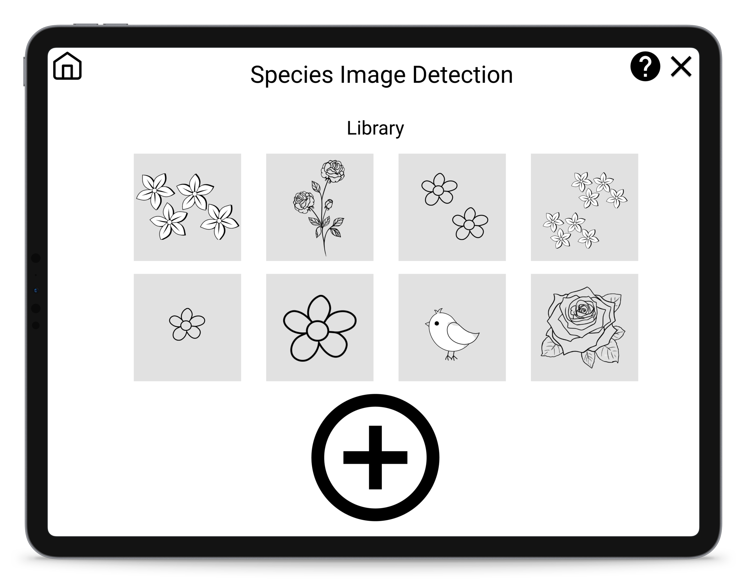
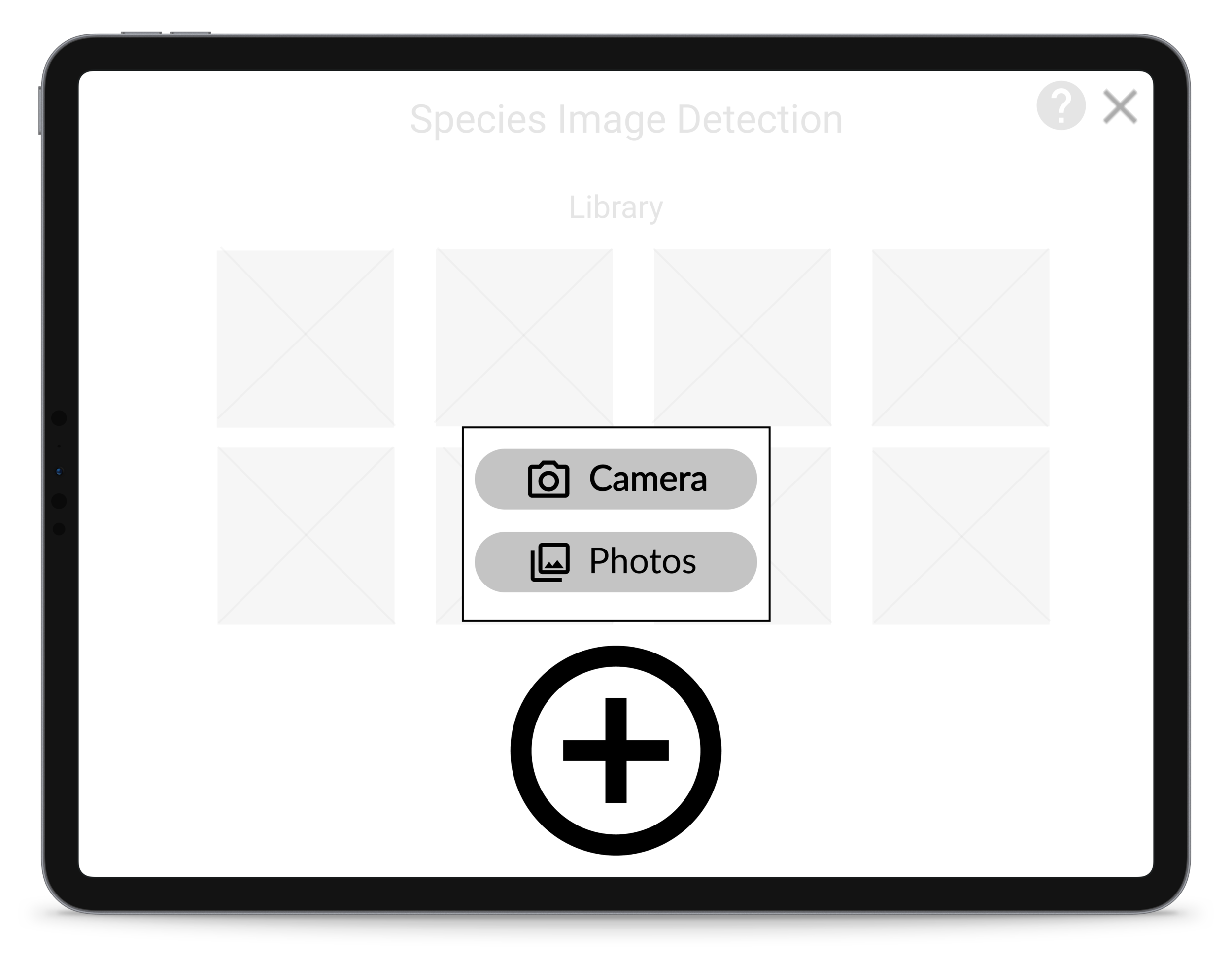
Task 1: Scan Flower Species
Scenario: You and your friend are hiking on a trail and your friend notices some pretty flowers off the trail and wants to go pick them. You remember that your smart map mentioned that there were a few endangered wildflower species to look out for. Task: Scan the flower species around you to learn more about them. [Completion Criteria]: Successfully scans and retrieves information on the flower species.
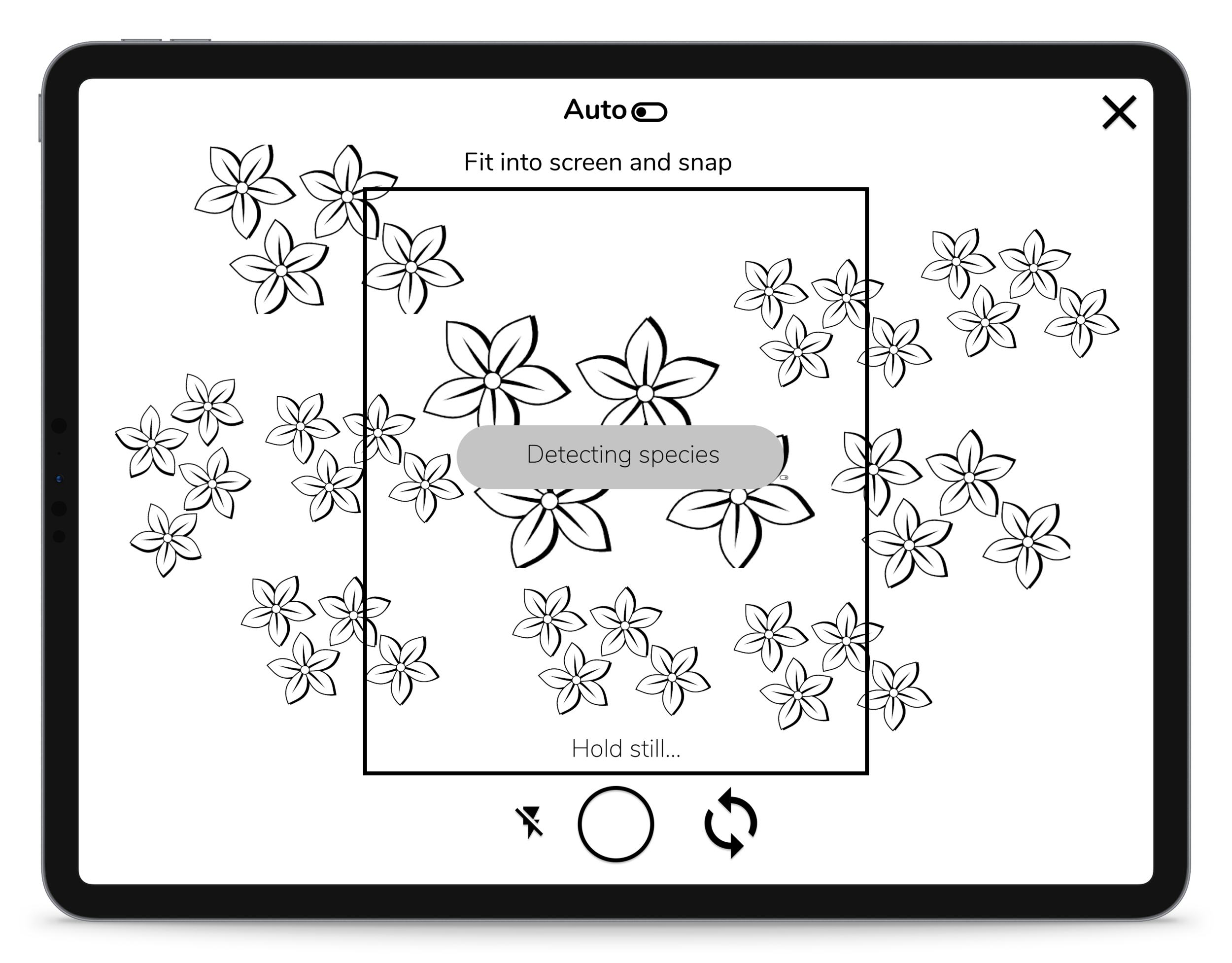
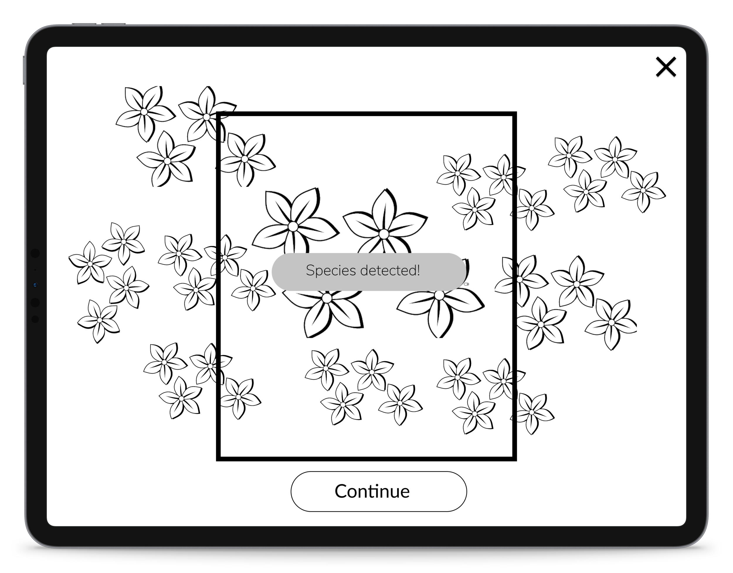
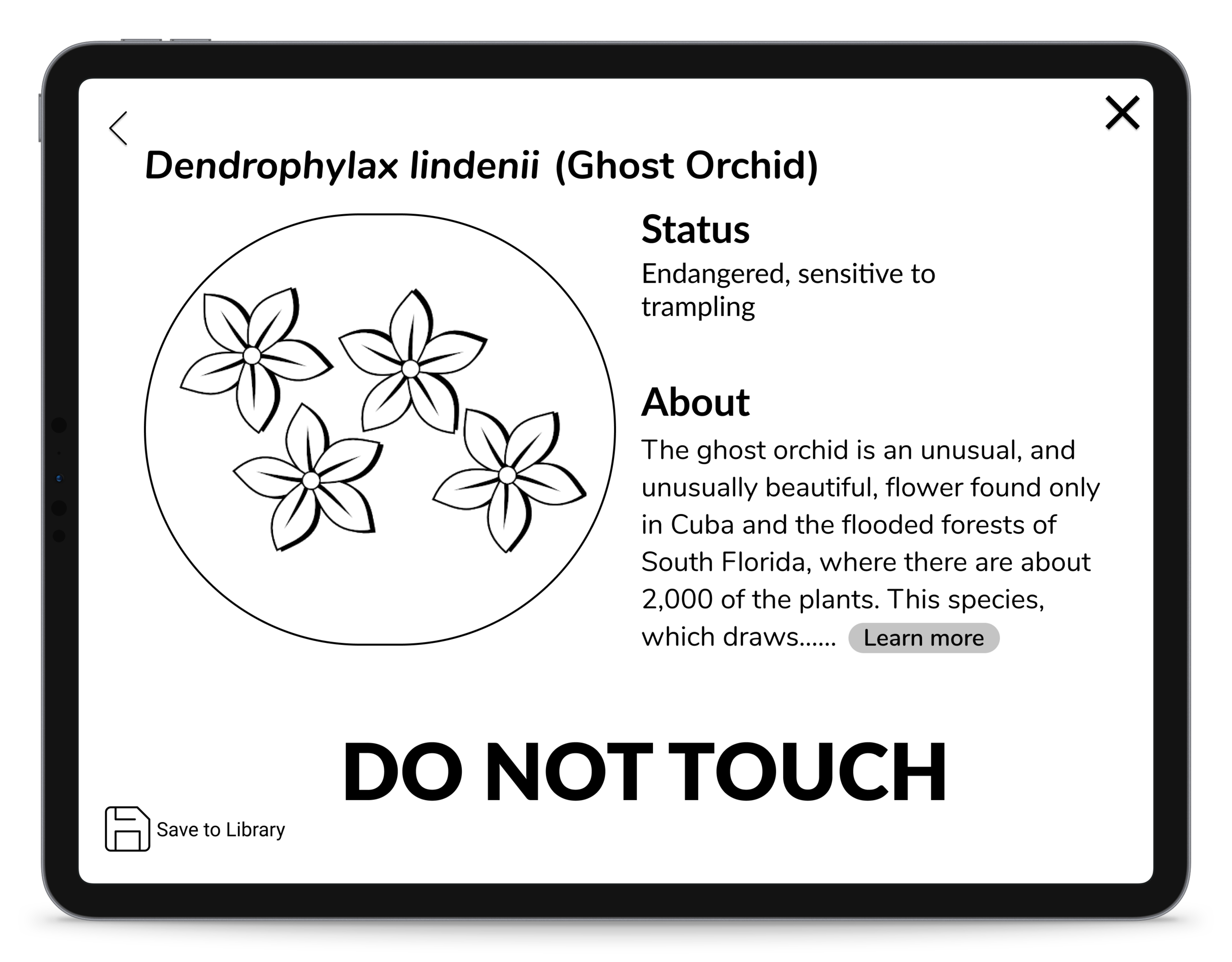
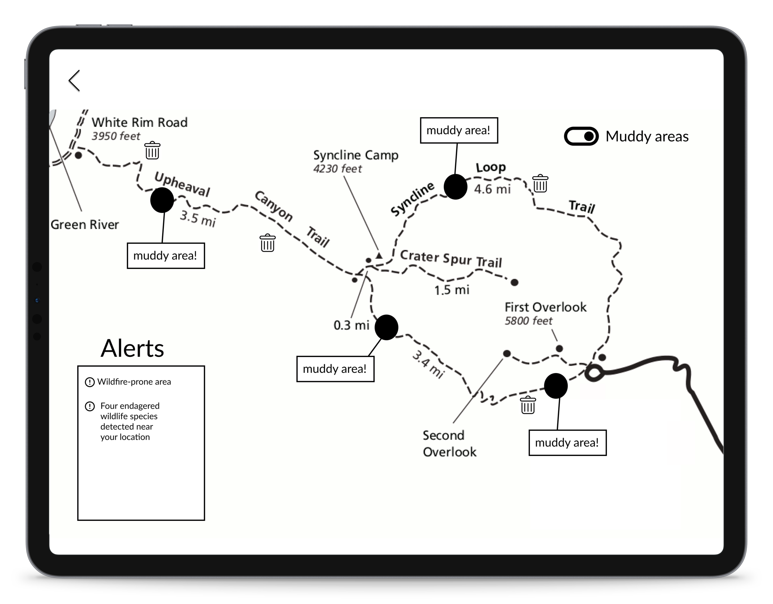
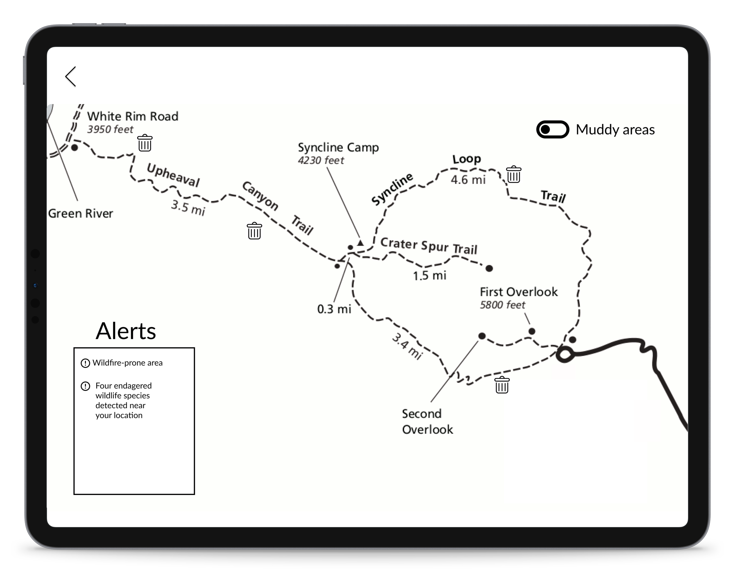
Task 2: Learn about Hike
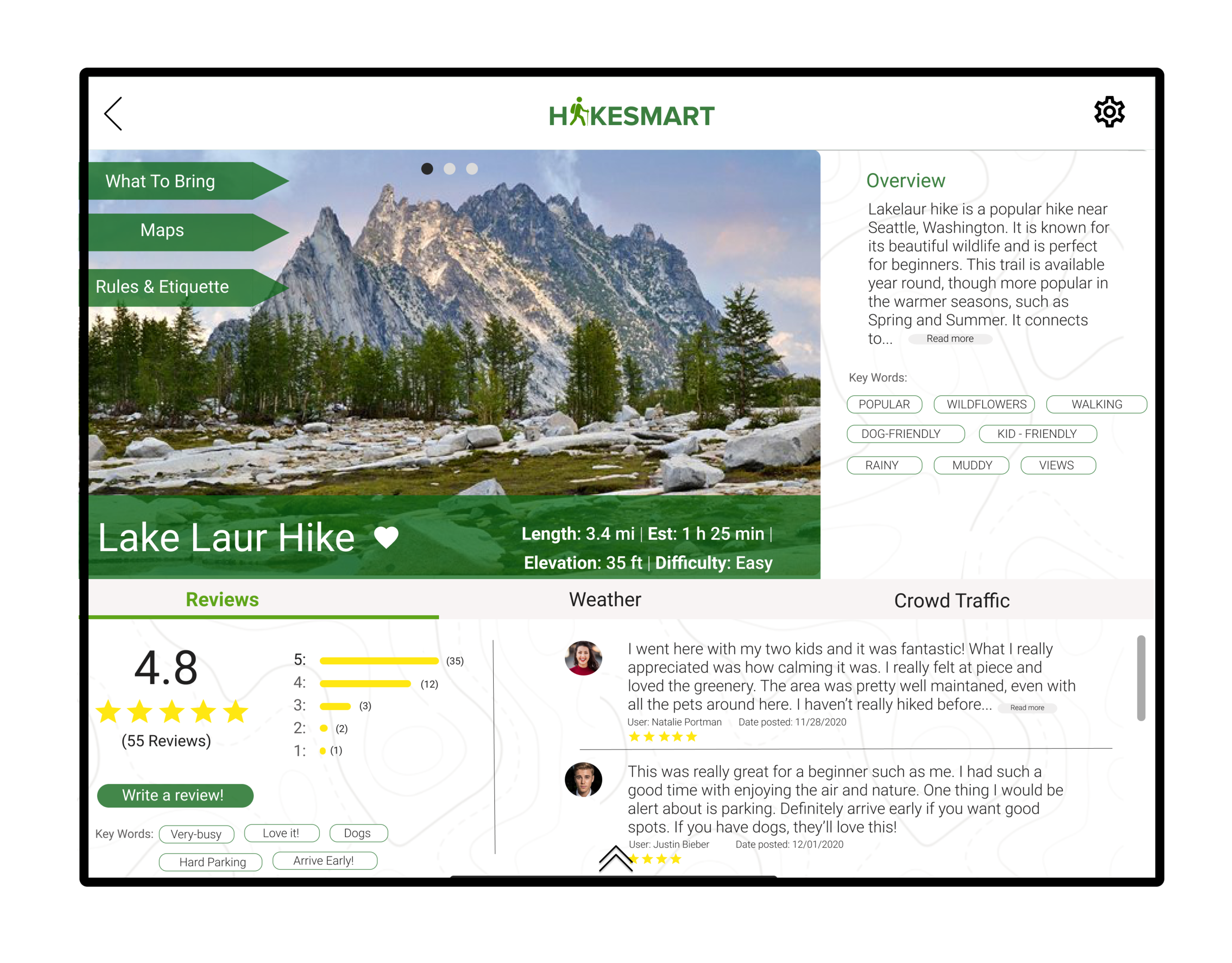
Scenario: You want to find a new hike near you and adequately prepare for it. Task: Discover a new hiking trail, explore what to bring on that specific hike, and learn about the trail conditions beforehand. [Completion Criteria]: Successfully retrieve list of items for the hike and look at trail conditions
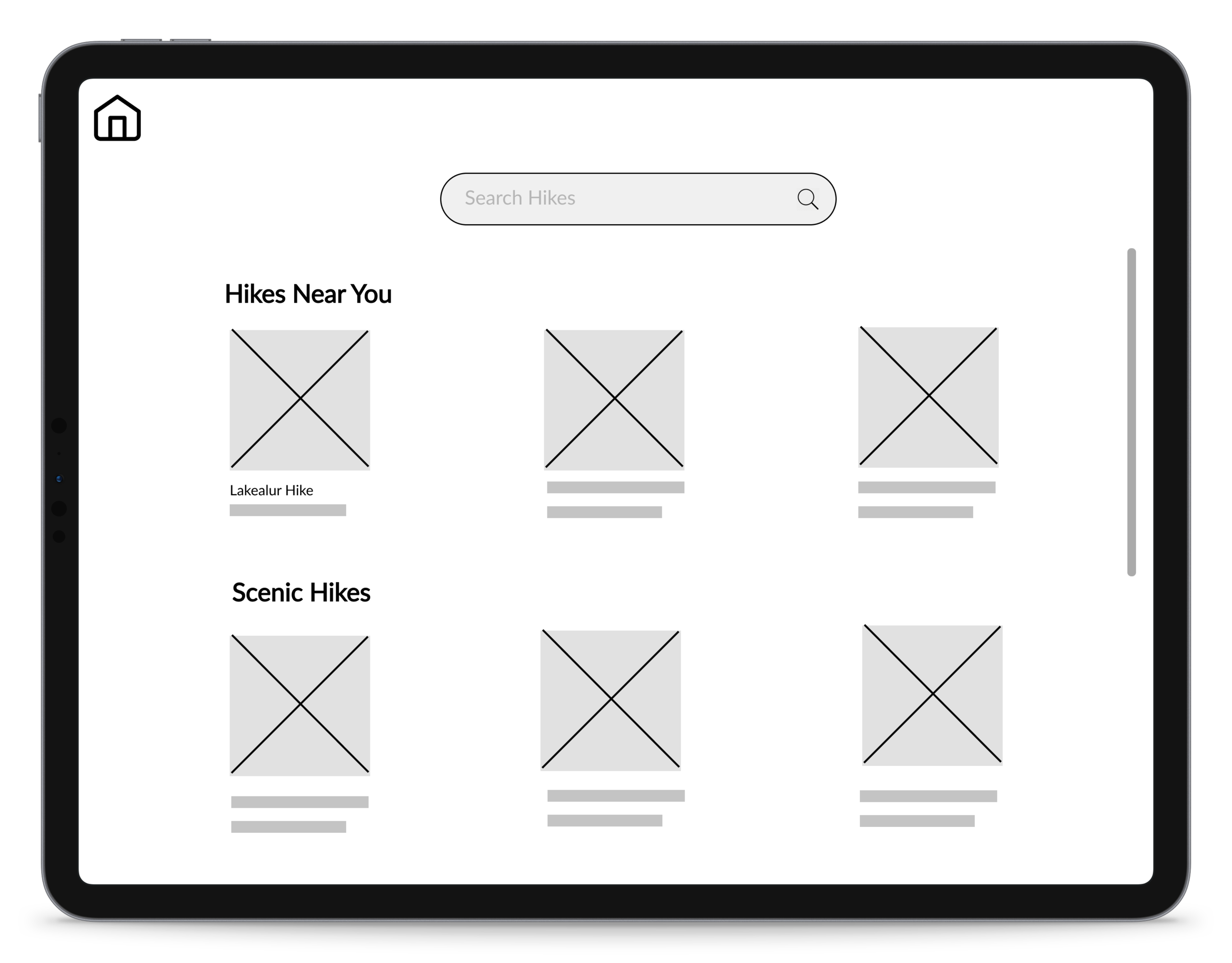
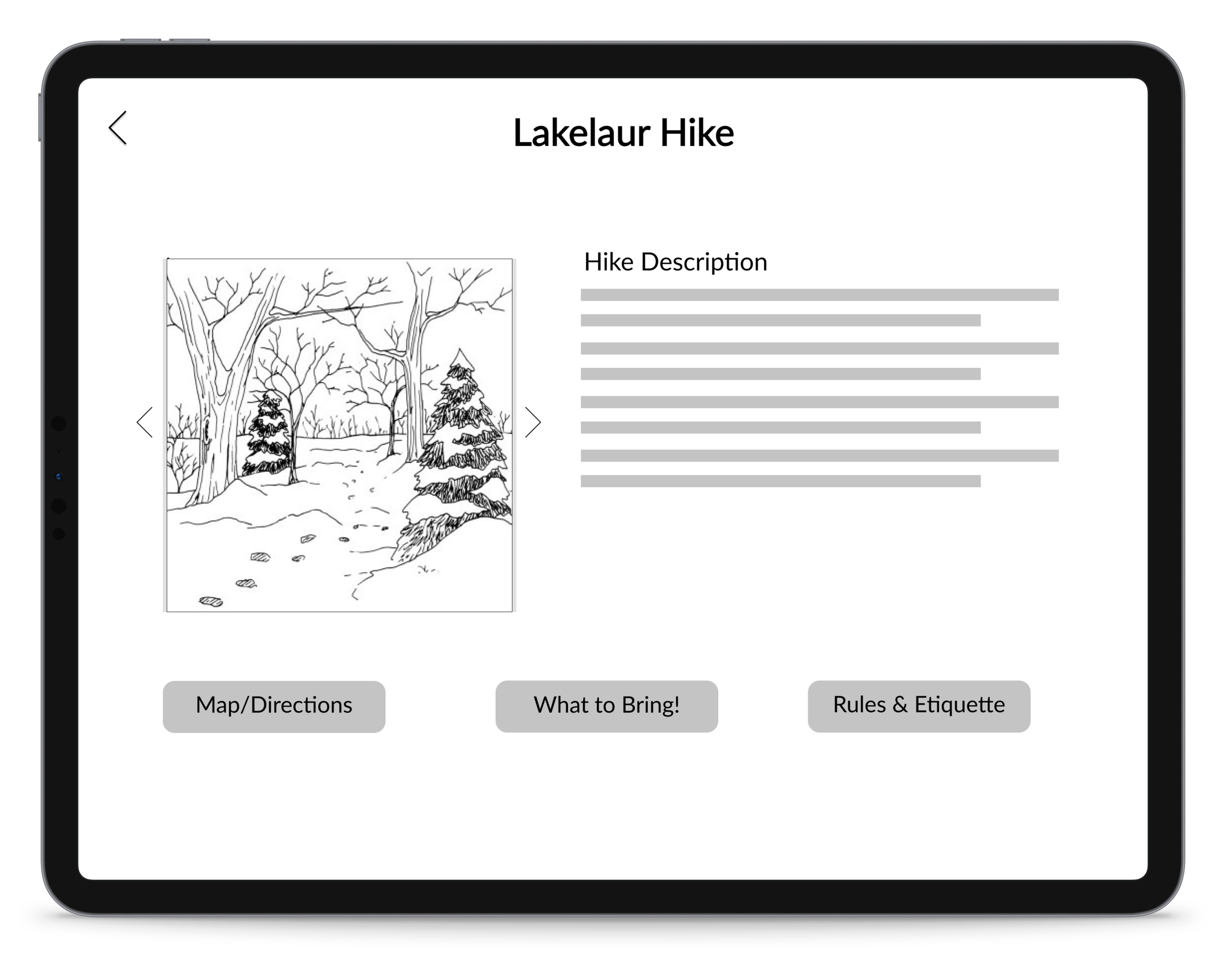
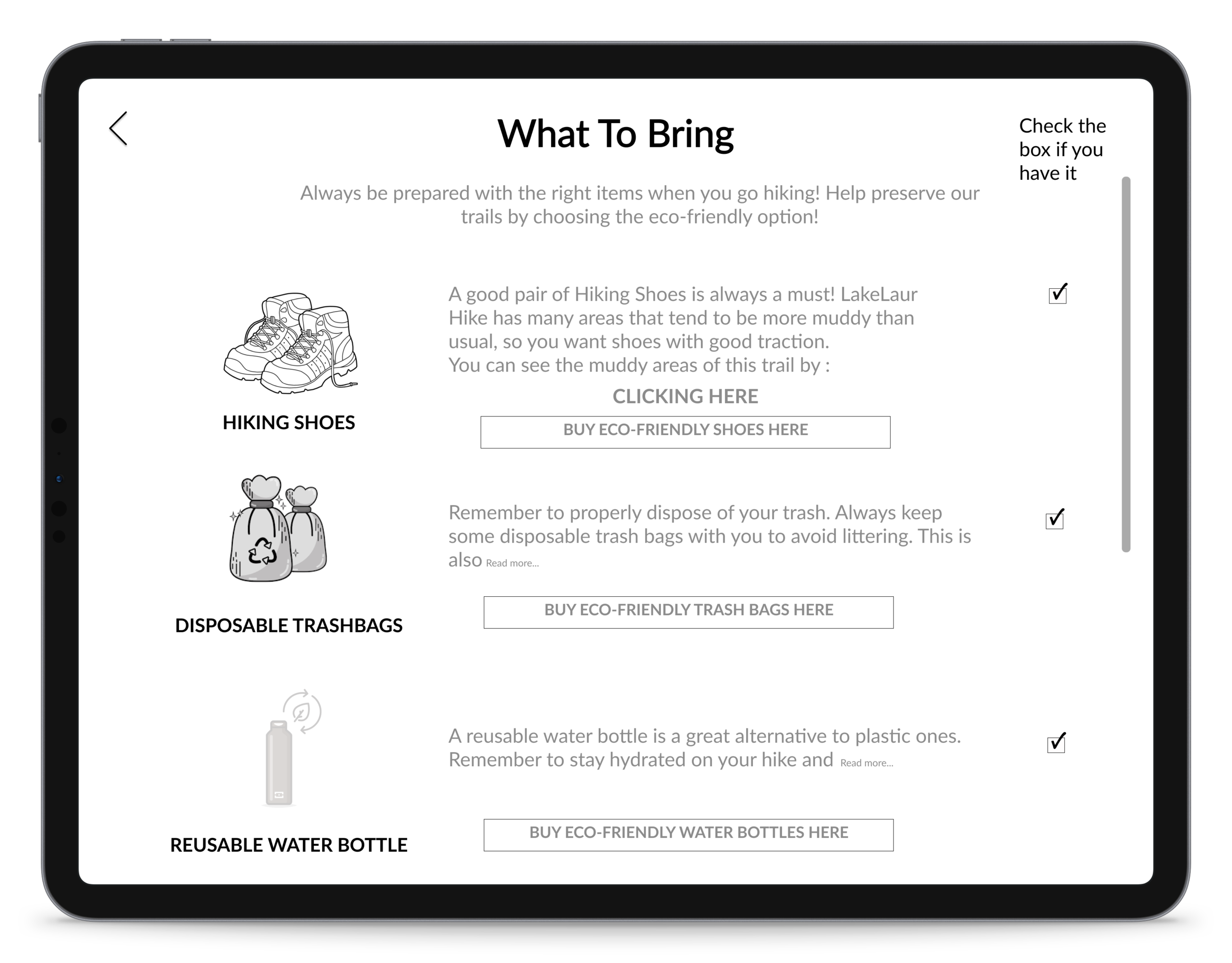
Task 3: Report Tree Damage
Scenario: You are walking on the trail/hike and your path is obstructed due to a fallen tree. Task: Report tree damage around you [Completion Criteria]: User must click on the report icon and successfully go through the entire process of reporting tree damage
Evaluation Findings
In order to ensure that our designs were meeting the needs of our target users, we conducted usability tests on our lo-fi prototype with four different novice hikers. We observed the users go through our three main pathways to see if they were able to complete the task, what suggestions they had for improvement, and what they liked and disliked about the product.
After synthesizing our findings, we identified what features of our map needed to be redesigned and what features worked well. Some of the feedback we received included completely changing one of our pathways for reporting damage and scanning plants. We were told that having two separate buttons in the taskbar taking the user to two separate camera screens was confusing. Users also mentioned wanting more control over the alerts feature instead of having alerts pop up randomly. Furthermore, we got valuable feedback on the design and concluded that some of our icons (such as the detect and the explore hikes icon) were not clear. These new perspectives allowed us to understand what aspects of our map weren't intuitive and allowed us to redesign our product to better serve our users.
Annotated Wireframes
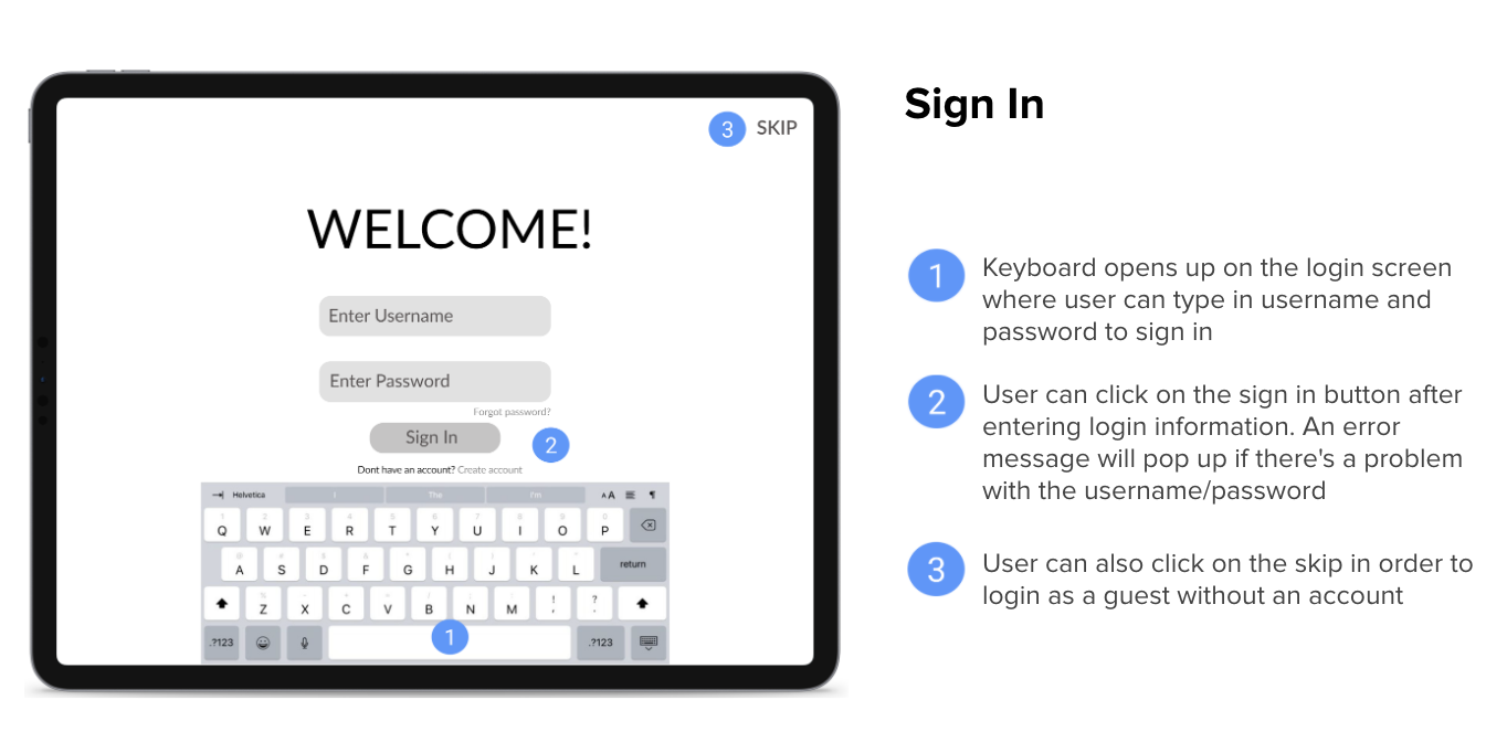
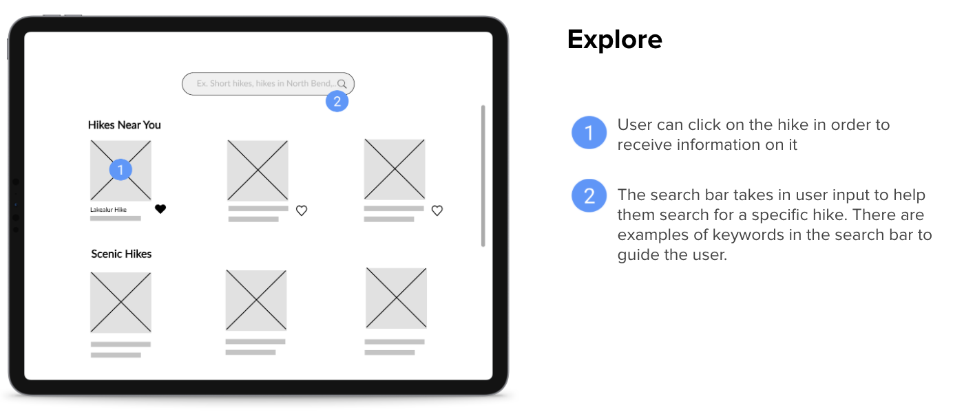
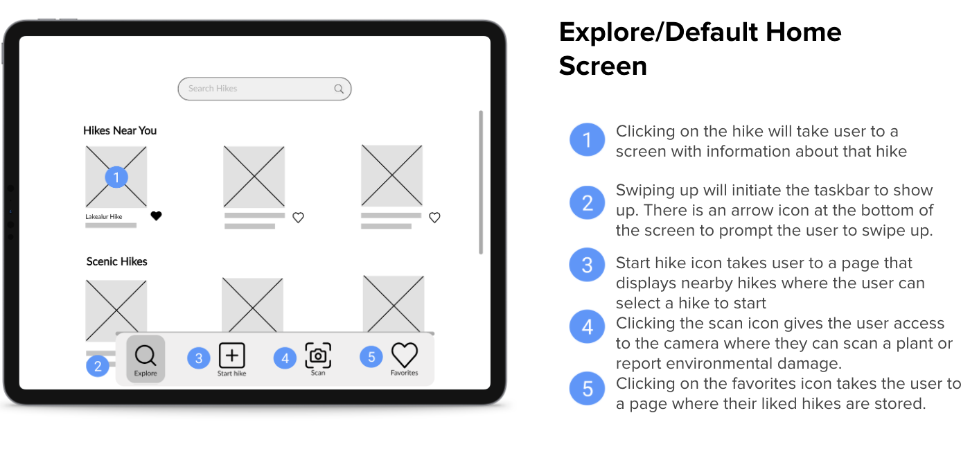
The understanding of our users we developed from our user research and feedback on the low fidelity prototype shaped the rest of the design of our product. In this step of our project, we digitized and developed our full product system. The annotated wireframes describe the function of many key features and points of interactivity in our design. These wireframes are still in a low fidelity version.
Information Architecture
Next in the process, we created an Information Architecture for our smart map to layout, understand and show the different hierarchies of pages and information in them. Doing this really helped us decide and design what kind of a flow we wanted to create for our users keeping in mind to not distract them from their environment and keeping everything simple and accessible.
Hi-Fidelity Prototype
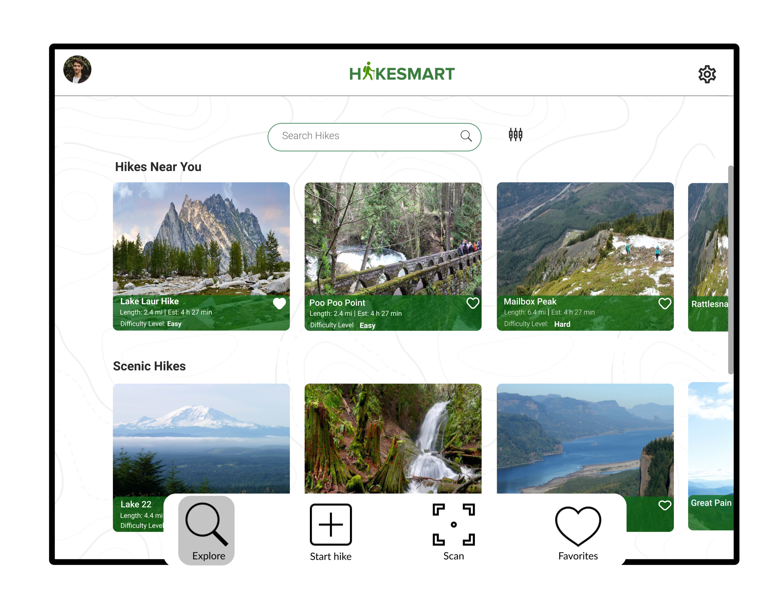
Creating hi-fidelity mockups was the final stage in our design process for this project. The hi-fidelity mockups encompassed all the work we had put in throughout the project in order to design refined wireframes that captured our product experience. We incorporated feedback and critique we had received from professors and peers about the visual design, organization, and features in order to develop a polished and refined prototype. We removed placeholders for text and images, and significantly improved the format of the screens that were present in the wireframes and low fidelity prototype, especially done so by accomplishing a grid and color scheme.These details and format were not present in any of our previous wireframes or designs, so this mockup truly captures our final design.
Hi-Fidelity Prototype Video
What Me & My Team Learned💡
Our Biggest Challenge 🚧
When we conducted our user interviews, a diverse range of issues was brought up. For example, one user mentioned that environmental damage and pollution was a significant deterrent to their hiking experience while another user mentioned that scheduling and coordinating was a vocal point of frustration. Our team attempted to tackle all of these problems in one application which proved to be challenging. We found that addressing all of these issues made it difficult to focus on a cohesive goal that we wanted our product to accomplish and resulted in some features that did not align with the core experience we were trying to create for our target user group. Many of these issues arose from the COVID-19 pandemic and the lack of a diverse group of people to perform user testing and interviews on. In the future, it would be wise to conduct more user research and usability tests to solidify our design requirements and to make sure that we stay aligned with what our target users need.
What We Learned 💡
This project contributed to our learning and education. One of the most significant things we learned was the idea of continually placing ourselves in the user's shoes throughout the design process. There were many times where we came up with an idea but had to take a step back and consider how this idea/feature would work on the user’s side. We also learned a lot about the importance of iteration and building off of critique. There is a significant difference between our early initial wireframes to the high fidelity prototype we developed in the end stage of our product. Getting multiple perspectives and feedback from peers and professors pointed out many flaws and inconsistencies we had not seen ourselves, such as layout, design, and intuitiveness.
What Would We do Differently? 🤔
There are also a couple of things we would do differently after having completed this project. One thing that stands out is to ask more follow up questions during the initial user interviews. We found that as we continued designing our prototype we came up with many questions we would have liked to ask potential users (we received feedback and answers to our questions during peer review, but advancing the initial user interviews is something we will keep in mind in the future). Furthermore, another thing we would like to do differently is to focus on not getting too attached to one idea or solution. We considered and discussed many different solution ideas, including apps, physical products, and a gamification approach. Getting too deeply attached to one feature complicated the process of narrowing down on a particular solution.


